top of page


Air Quality Index Infographics
These three infographics are designed solely based on the Millennial demographic. Each panel describes a specific factor in our environment that is heavily affected by pollution. Using the research I found on the demographic as a whole, I chose to include mostly imagery, as millennials prefer designs that are easy to read with somewhat complex layering. For my research methods, I completed interviews as well as photo-elicitation methods with millennial individuals to gain an understanding of what's most eye-catching to them.
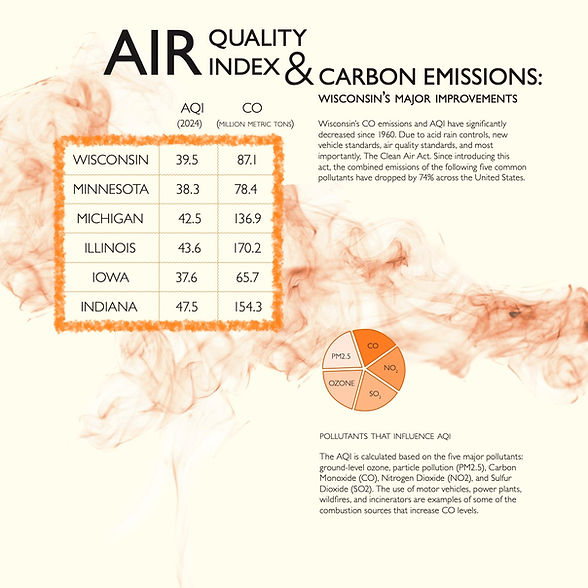
The panels represent a fever chart showing the average AQI experienced per person in the United States of America, a bar chart showing the levels of Carbon Monoxide emissions decreasing over time, and a table chart comparing Wisconsin and its neighboring states current AQI and CO emissions


bottom of page